Posted: November 1st, 2019
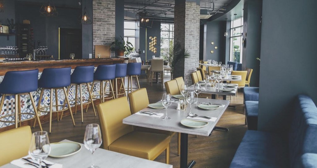
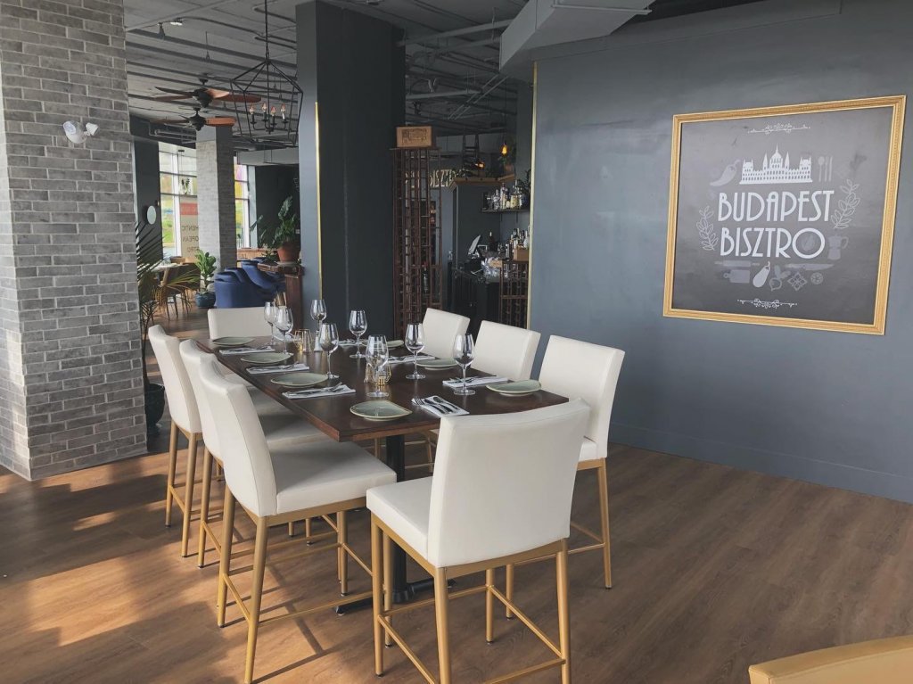
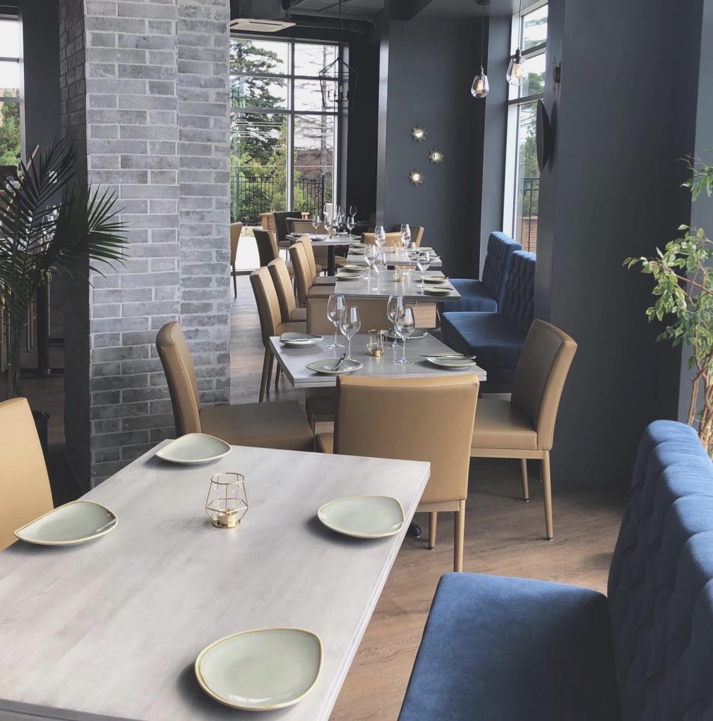
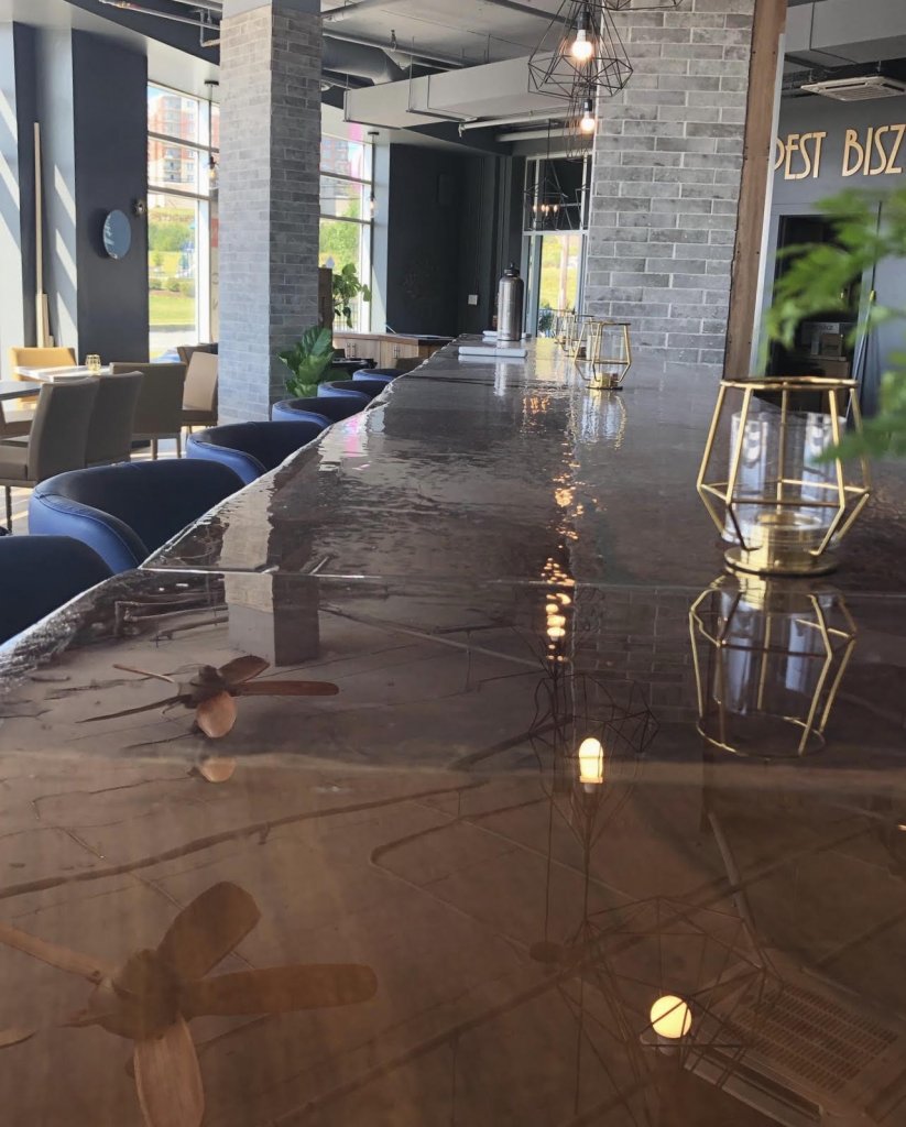
Congratulations to Jan Wicha and family on their newest restaurant, Budapest Bisztro!
As always, it was a pleasure to work together to create a comfortable and functional space.
Posted: July 30th, 2019
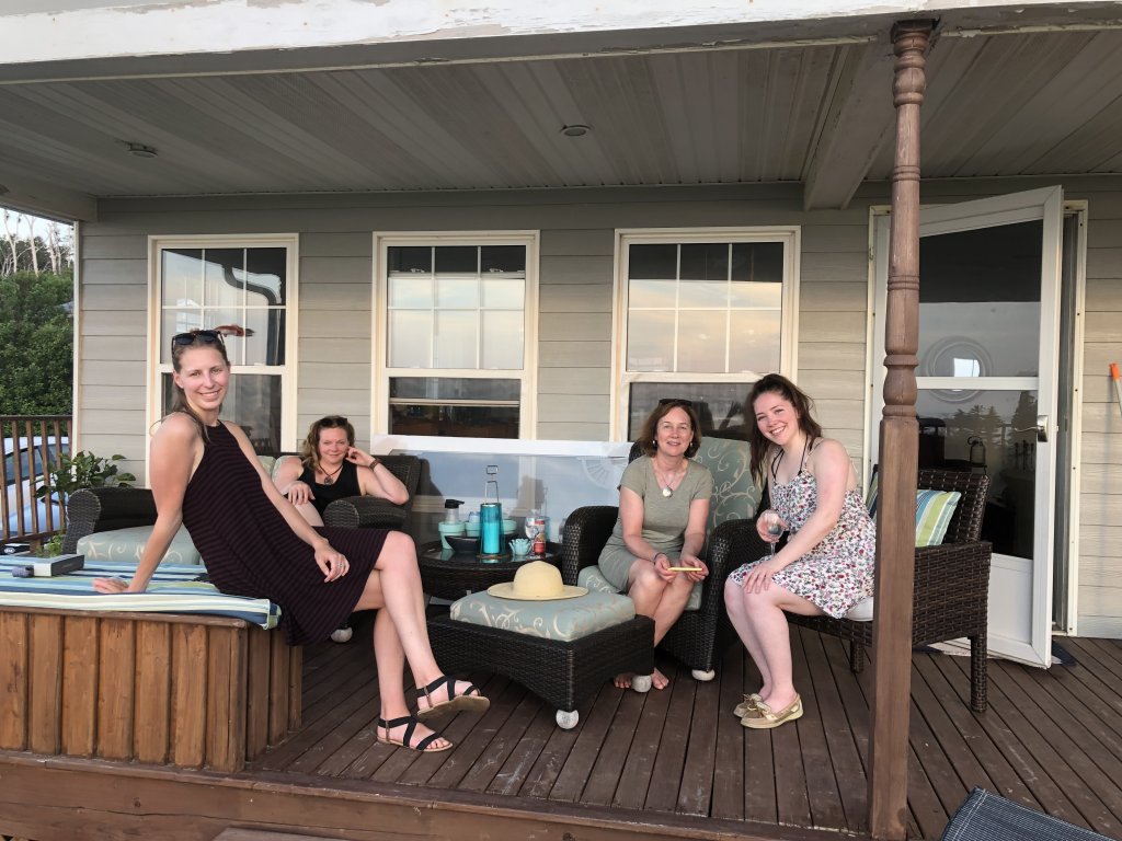
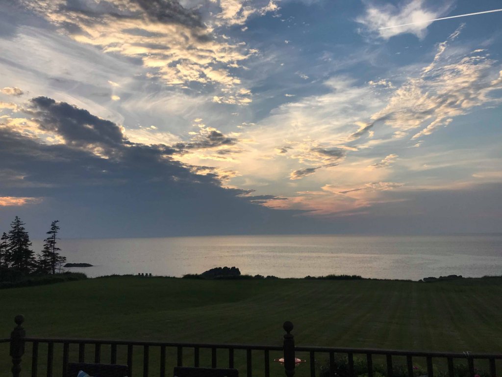
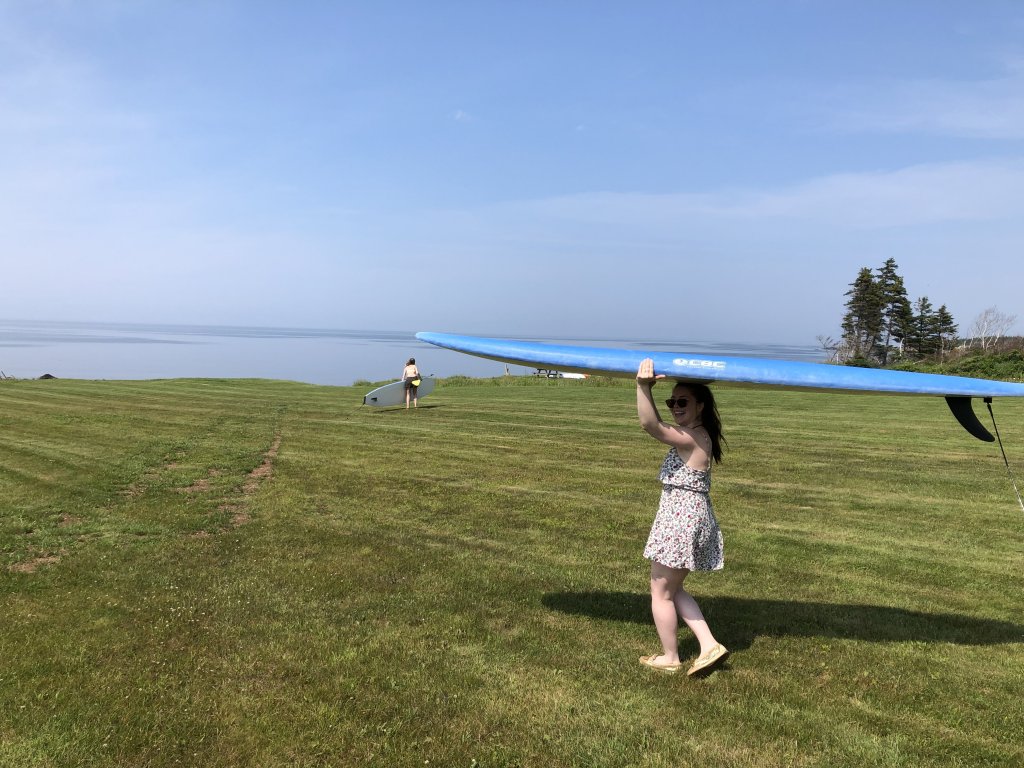
The MAC Team having some summer fun in Arisaig, Nova Scotia!


Posted: June 14th, 2019
Every picture tells a story and every story tells of a place. Developers are ever-more cognizant of the place in which their hotels stand and how that place can be incorporated into the story of the structure. It’s one of the many interior-design trends — along with streamlined furnishings and synced-up tech — that hoteliers have embraced to not only distinguish themselves, but to create unique, personalized experiences within their guestrooms.
A
Sense of Place
Brand standards continue to assert each brand’s signature style, but many
hotels are relaxing their guidelines to allow the individual characteristics of
a locale to shine through in the design.
“In the past, Marriott, for instance, was really keen on having its standard
red and gold everywhere, no matter where you were,” says Jennifer Kurtz of
Vancouver-based Kurtz Design, whose projects include Vernon, B.C.’s, Sparkling
Hill Resort and Whistler, B.C.’s Hilton Whistler Resort & Spa. “Now, brands
overall are more focused on having a connection to time and place. It makes the
design a lot more interesting and it’s appropriate. You wouldn’t take a hotel
design in Richmond and plant it in Whistler. From lighting to art work to
materiality, it’s very specific — and it should be.”
Kara MacGregor, principal of Halifax-based MAC Interior Design, whose projects
include Delta Hotels and Resorts, New Castle Hotels & Resorts and Rodd
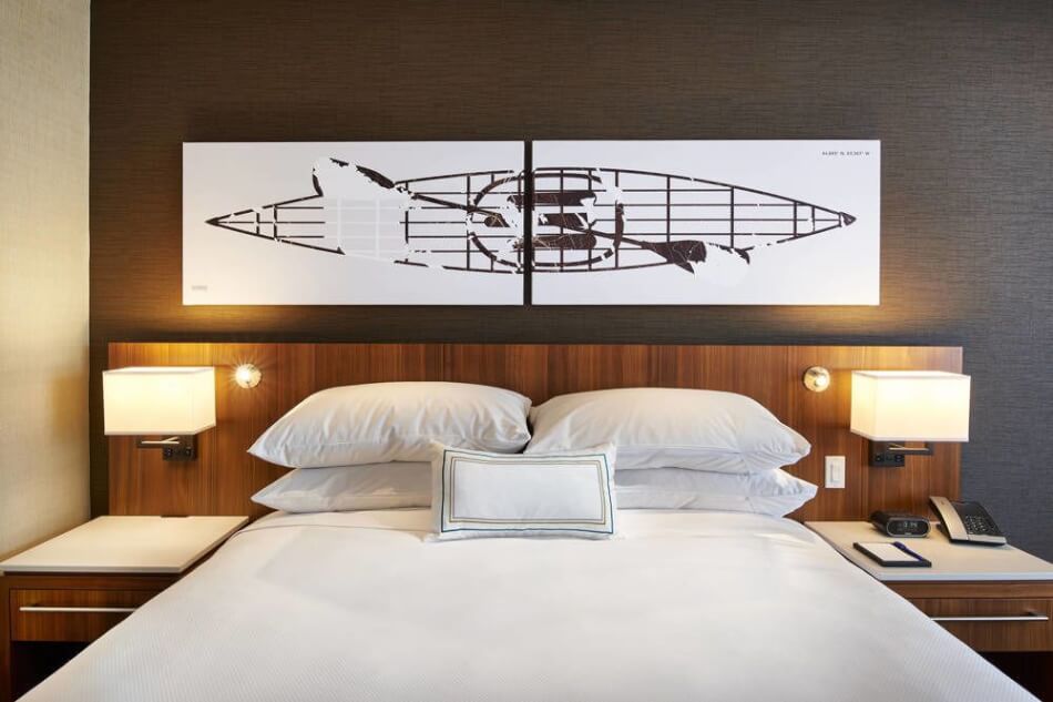
Hotels & Resorts properties, agrees. While designing the Delta Hotel in
Dartmouth, N.S. — which is home to an Olympic-class paddling community — she
commissioned local artists to create a series of paddling and wave motifs to
adorn its rooms. “The ability to tell the local story through abstract art and
related activities…creates an experience that resonates a little closer to the
community,” she explains.
Marti Gallucci of Toronto’s Mason Studio, who designed the Andaz Ottawa ByWard
Market and Toronto’s Kimpton Saint George Hotel, echoes the sentiment. “We
often tell stories of the places we’re in through the origins of an object, finish
or technique,” she says, noting Andaz Ottawa’s polished- and brushed-copper
details, which reference the Parliament Buildings and the copper penny; use of
wood logs in a nod to the logging industry; and graphic motifs in the custom
rugs to acknowledge the indigenous community.
For the refurbishment of the 1958 Fairmont The Queen Elizabeth, Nicole Vekemans
of Sid Lee Architecture in Montreal — who also helped transform the century-old
Birks jewelry store in Montreal into the new Hotel Birks — drew colour
inspiration from Montreal’s very distinct seasons. “[In winter], at the end of
the day, the sun sets on the snow and the reflection is blue and pink. We
incorporated some of those colours — the off-white, the grey, taupe, pink and
blue — [into the design],” she explains. Room designs also drew inspiration
from the fresh green of spring, extreme heat of summer and red and golds of
fall.
MacGregor explains that, while colour schemes can vary depending on the region,
they also depend on the target demographic. “Younger 20-something crowds tend
to favour darker [hues],” she says. “Lighter, more-neutral colours and
materials reflect a more-sophisticated, higher-income demographic.”
Form
and Functionality
Designers are increasingly answering the call for streamlined and multi-purpose
guestroom furniture, Gallucci says. “Rather than cluttering the space,
functions are united to feel appropriate for several tasks. We have to be
creative in designing flexible, multi-purpose pieces that still fulfill
ergonomic and expected requirements.”
MacGregor says, “Most people want to sit in a good chair, maybe put their feet
up, with a tiny pull-up table for work that can also be used as a room-service
tray.”
MacGregor says she’s also seeing a continuation of the trend to not only
elevate table tops and benches off the floor, but to meld them all into one
long continuous piece. “[Previously] you would have a desk, a refrigerator, a
table for the coffee maker, a luggage bench and a separate panel for the TV.
Now it’s streamed into one piece that creates a seamless line.”
Elevated furnishings are also easier for housekeeping, which can now slip a
vacuum into previously hard-to-reach spaces.
MacGregor notes the number of drawers appearing in guestrooms has largely been
reduced to just one for personal items and another for a laptop or tablet. Many
closets have also been replaced by wall hooks and desks have either been
downsized, designed to do double duty as a nightstand or eliminated altogether.
Vekemans notes travellers, especially those on business, “want an adjustable
table that can double as a work space and eating area — perhaps on rollers so
it can be moved around for various purposes.”
Extra ports, plug-ins and chargers are also trending, as are multiple reading
lamps, adds Vekemans.
“There’s
been a move away from embedding technology into the room and toward
facilitating what the guests are bringing in,” MacGregor adds. Instead,
operators are favouring dedicated ports that allow guests to connect their own
devices to the TV to watch their own content.
Kurtz adds those numerous outlets should be “intuitive, easy to find, not under
a desk or hard to get to.”
And, when it comes to in-room amenities, MacGregor says the Keurig has not only
replaced the traditional kettle and coffee maker, it’s become an expected
feature. And, where mini-fridges used to be the domain of the smaller brands,
families and sports teams look for them at all levels, to chill water bottles
or medication — especially if the hotel is near a hospital. The microwave, by
contrast, is being phased out of the guestroom and into communal areas.
The
Right Light
Lighting is another element of guestroom design that should not be overlooked.
“As people age, they need more light in the same space,” says MacGregor.
“People in their 20s and people in their 60s need two different light levels to
see the room the same way, so having the ability to vary light levels is really
key.”
She says many hotels had previously invested in fancy switches placed
discreetly around the room, but that backfired when guests got frustrated
fumbling for the switches. “Now it’s simpler, with the switch positioned on or
close to the fixture.”
And, where darkening shades for sleep once prevailed, guests now appreciate natural light.
Written by Robin Roberts
Posted: May 23rd, 2019
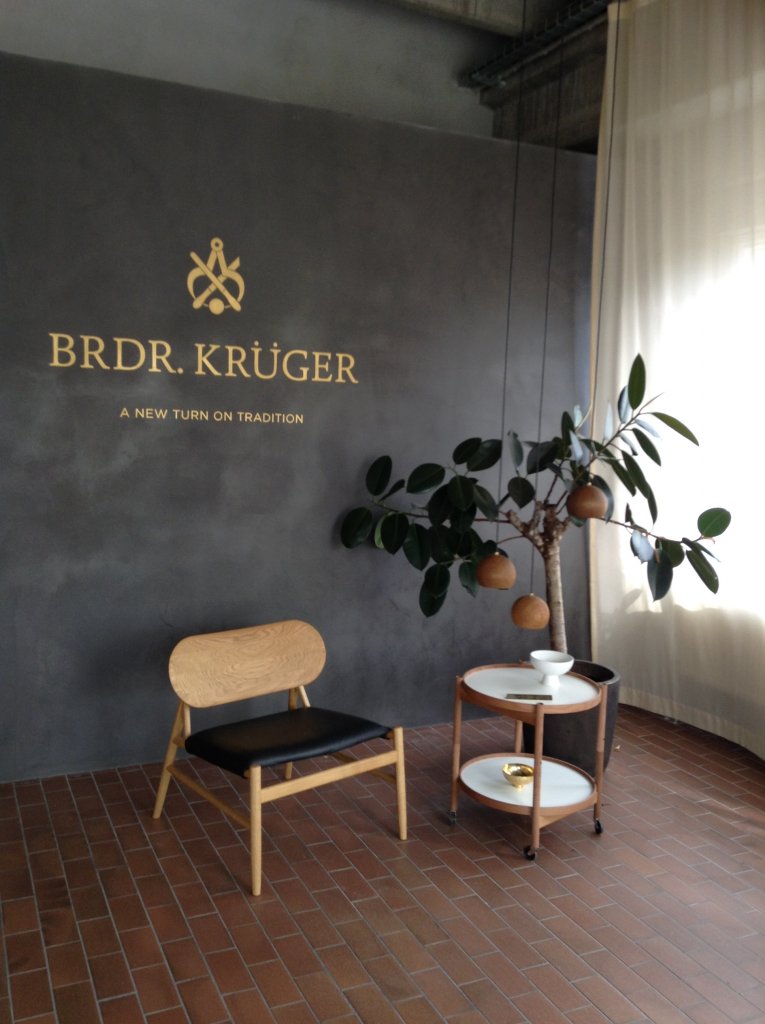
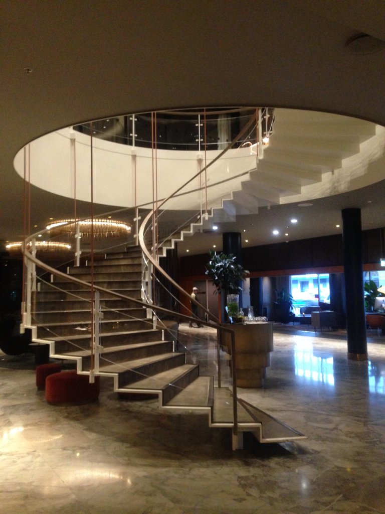
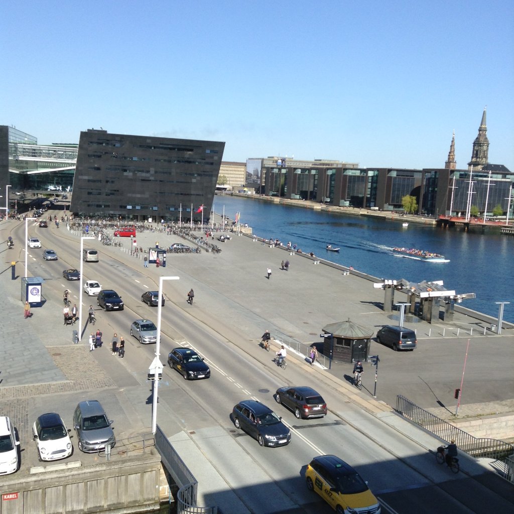
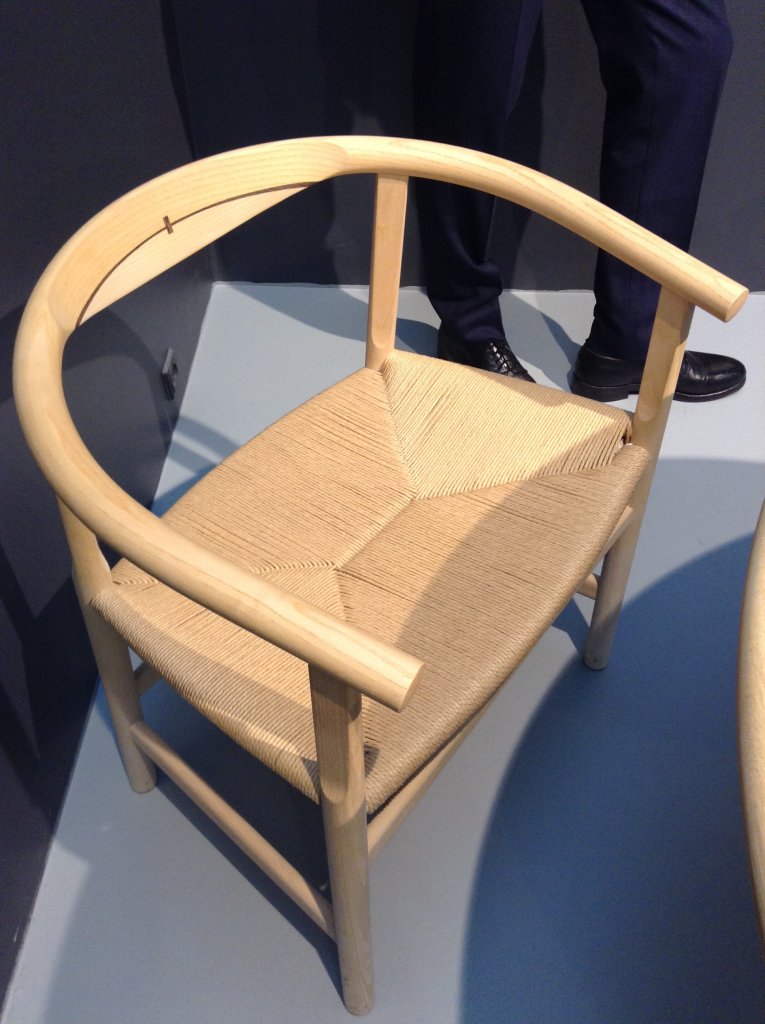
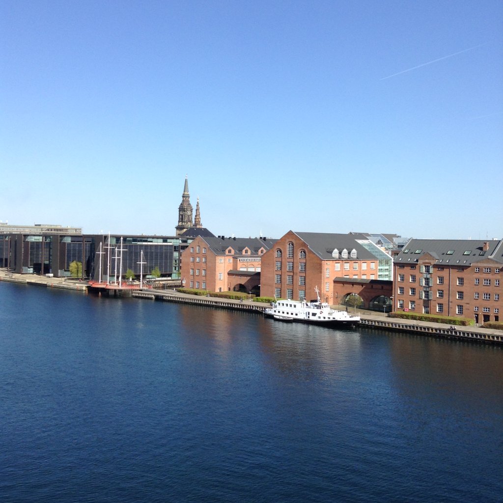
Lori has just returned from an IDC sponsored Design Week in Copenhagen, Denmark, attending the Trends and Traditions furniture and lighting show as well as touring Danish buildings of architectural note and visiting showrooms where beautiful and iconic Danish furniture is being made. So inspirational to see the crafting of furniture recreated from furniture design greats like Arne Jacobsen and Hans Wegner.
Posted: May 8th, 2019
MAC Interior Design was honoured to be acknowledged by the woodwork manufacturers this April at the 2019 AWMAC Atlantic Awards . Congratulations to our co-winners, Rodney Enterprises for the Delta Dartmouth Project. Thank you to AWMAC for a wonderful event!

